Writing
← Writing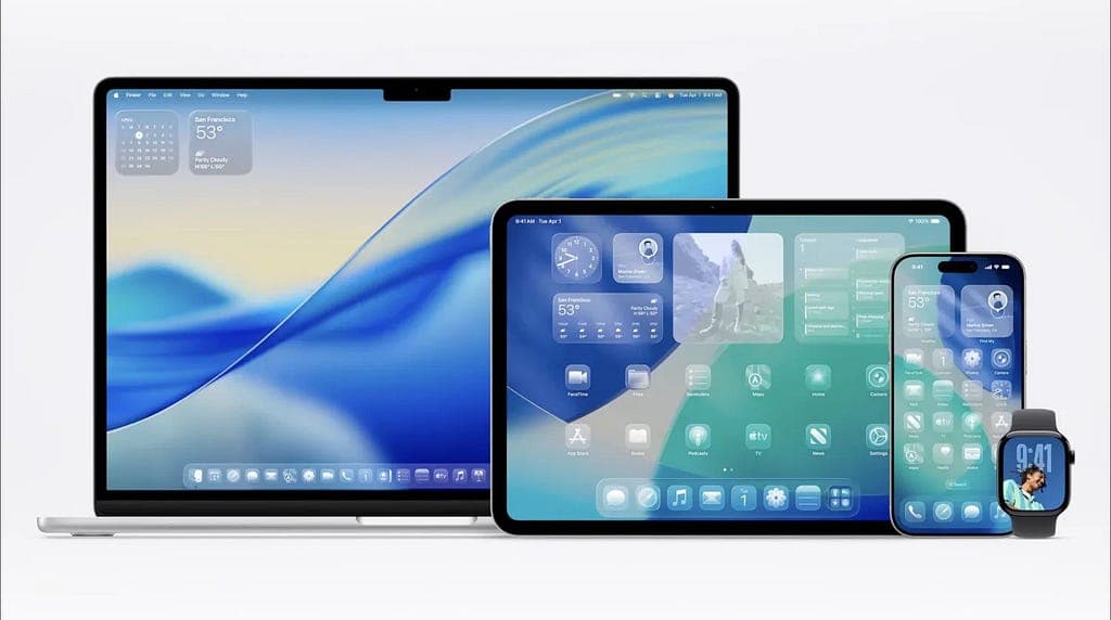
Apple's Liquid Glass Design in iOS 26: Innovation at the Cost of Accessibility?
Apple's Liquid Glass design language in iOS 26 is visually stunning. But does it trade usability and accessibility for aesthetic novelty? A critical look at what this shift means for the 15% of users who rely on clear, predictable interfaces.
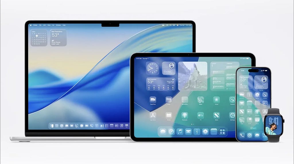
Apple's Liquid Glass design language, introduced in iOS 26 at WWDC 2025, is the most visually aggressive update to iOS since the iOS 7 redesign. Semi-transparent UI layers, dynamic lighting effects, and glass-inspired reflections now span notifications, control centers, and widgets. It draws from visionOS and spatial computing. It looks striking in demos.
That is the easy part to evaluate.
The harder question is what this design does to people who depend on clear, predictable interfaces: users with low vision, motor disabilities, or cognitive conditions. That group is not a small edge case. It is roughly 15 percent of the global population.
The Visual Complexity Problem
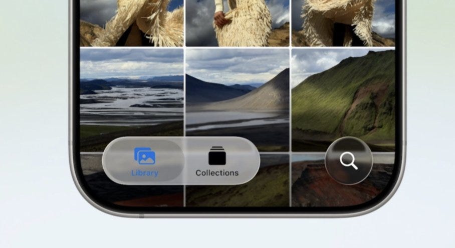
Liquid Glass replaces flat surfaces with translucent, reflective layers that shift with ambient light and background content. The effect is depth and physical presence. The tradeoff is reduced hierarchy.
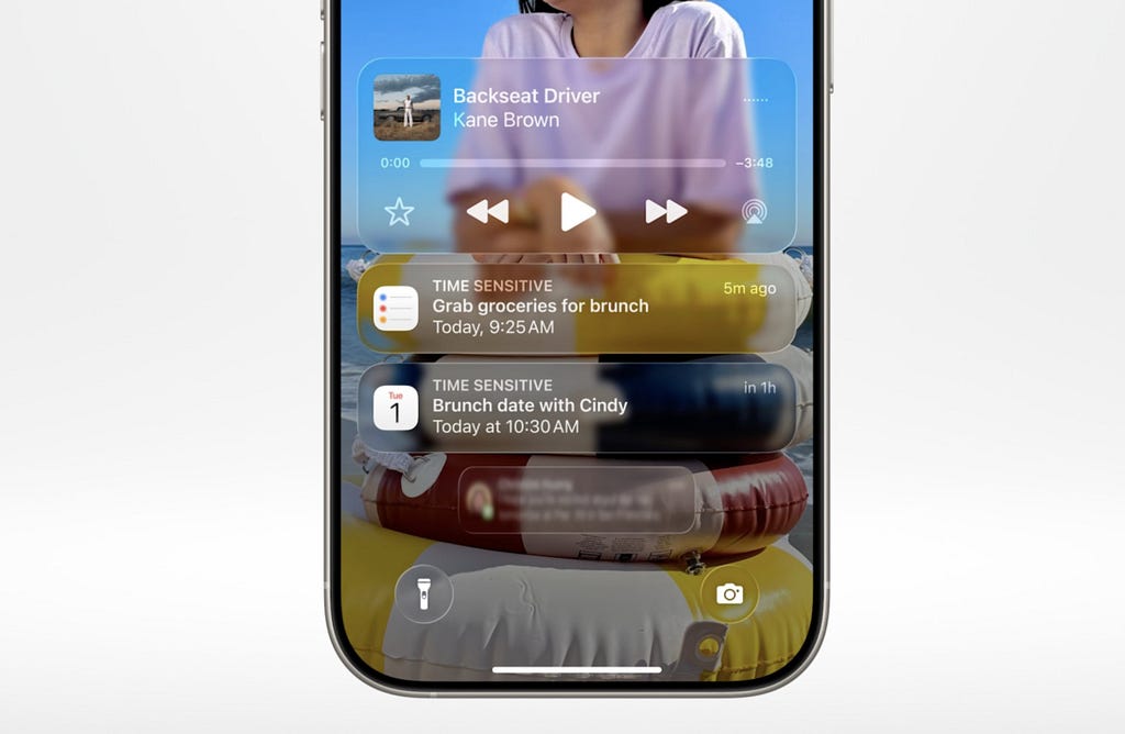
When everything reflects and floats, critical alerts look the same as trivial notifications. Background images bleed through interface elements. Users must work harder to parse what is on screen. This is not hypothetical friction; it is the same failure Windows Vista's Aero interface ran into, where visual richness came at the cost of readability.
Increased cognitive load across every interaction is a design regression regardless of how sophisticated the rendering is.
Accessibility Failures
Apple has spent years building accessibility credibility. VoiceOver, Dynamic Type, and low-vision features have set industry standards. Liquid Glass works against several of these.
Text on blurred, translucent backgrounds frequently fails minimum contrast ratios under WCAG guidelines. In Clear Mode, where icon backdrops are removed for full translucency, interface elements become harder to locate and harder to read. Users with cataracts, macular degeneration, or other vision impairments face real difficulty with core OS features.
The motor implications are also significant. Soft edges and fluid animations make buttons less distinct and harder to target precisely. For users with tremors, interaction error rates go up. Continuous movement and dynamic lighting create real problems for people with ADHD or sensory sensitivity.
These are not accessibility preferences. They are barriers to basic use.

The Jobs Lens
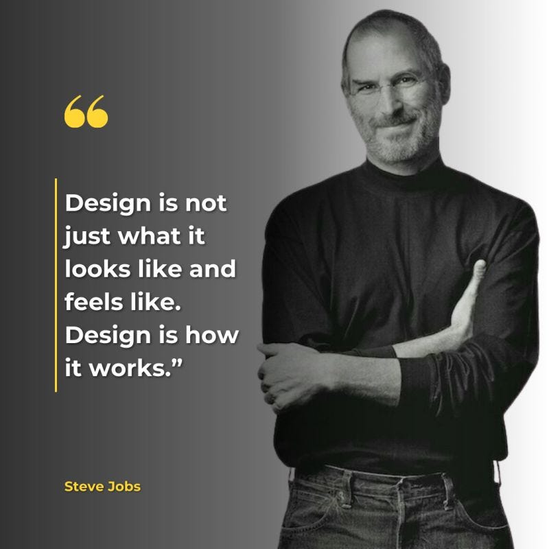
Steve Jobs' design philosophy was built on function over appearance. His 1979 visit to Xerox PARC left him convinced that design's job was to make technology feel natural. Every element should have a clear purpose. Interaction should feel effortless, not decoded.
Liquid Glass does the opposite. It asks users to work out an interface rather than use one. Affordances disappear beneath visual effects. Hierarchy dissolves into aesthetic complexity. The interface serves the demo more than it serves the user.
Jobs said design is how it works. By that measure, Liquid Glass has a problem.
What a Better Version Looks Like
None of the following ideas require scrapping the visual concept.
Apply translucency selectively. Core UI elements should stay solid and high-contrast. Reserve glass effects for ornamental or non-essential areas where the cost of reduced legibility is low.
Introduce a "High Clarity" mode. Disable dynamic backgrounds, reduce animation, and sharpen visual boundaries. Apple has done this before. Reduce Motion and increased contrast options both emerged as direct responses to iOS 7 criticism.
Restore clear affordances. Shadows, outlines, and consistent placement cues let users identify interactive elements reliably within a visually rich environment.
These are not accessibility compromises. They are the harder design problem, and historically Apple has been good at solving it.
The Actual Tradeoff
Liquid Glass shows what is technically possible at the intersection of software design and spatial computing. The rendering is sophisticated and the visual ambition is real.
But sophistication is not the same as usability. For the 15 percent of the global population living with disabilities, and for the many more who rely on cognitive and motor predictability in daily device use, visual novelty is not a benefit if it makes core functions harder to reach.
Design that works for everyone is not a constraint on creativity. It is the harder and more interesting design problem.